Poliwager Adoptables Design 2.0!
-
moon5330

- Poliwag Kid

- Posts: 76
- Joined: Fri Aug 03, 2012 11:40 am
- Gender: She/Her
-
savol456
- Poliwag Baby

- Posts: 14
- Joined: Sat Mar 24, 2012 8:51 pm
- Gender: He/Him
1st reaction: Oh God, this is terrible! Why?
after a minute: Hey this is nicer with the boxes, sure makes the shelter nicer looking. I could get used to this.
So yeah, nice.
nice.
after a minute: Hey this is nicer with the boxes, sure makes the shelter nicer looking. I could get used to this.
So yeah,
-
Slix

- Administrator

- Posts: 6665
- Joined: Mon Nov 15, 2010 7:08 pm
- Gender: He/Him
- Location: In a beautiful collision.
-
kwaks

- Poliwag Baby

- Posts: 26
- Joined: Mon Oct 08, 2012 11:14 am
- Gender: He/Him
-
Foxamivalth

- Poliwag Baby

- Posts: 23
- Joined: Fri May 04, 2012 11:40 pm
- Gender: He/Him
The old one looks more beautiful and fit my phone better. :c



-->Please Feed Me<--
-
BLEACHIchigo1

- Poliwag Teenager

- Posts: 168
- Joined: Sun Jun 03, 2012 4:16 am
- Gender: She/Her
- Location: In my own world.
-
Slix

- Administrator

- Posts: 6665
- Joined: Mon Nov 15, 2010 7:08 pm
- Gender: He/Him
- Location: In a beautiful collision.
What pages is this bug on? I can't help unless I know where to look.
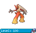
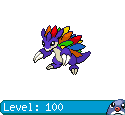
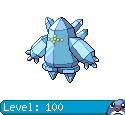
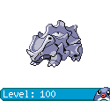
I updated the profile and PC pages with tables for the Pokémon and eggs. It looks much cleaner than before, plus it shows the Pokémon's name and level (or egg steps if it's an egg). Also, it italicizes the names and fades the image a little if you've already clicked the Pokémon during the day, so it's easy to tell which you've clicked and don't need to again!
I updated the profile and PC pages with tables for the Pokémon and eggs. It looks much cleaner than before, plus it shows the Pokémon's name and level (or egg steps if it's an egg). Also, it italicizes the names and fades the image a little if you've already clicked the Pokémon during the day, so it's easy to tell which you've clicked and don't need to again!
-
moon5330

- Poliwag Kid

- Posts: 76
- Joined: Fri Aug 03, 2012 11:40 am
- Gender: She/Her
-
mihez
- Poliwag Baby

- Posts: 44
- Joined: Sat Feb 18, 2012 12:40 pm
- Gender: He/Him
i have a suggestion and a quick little thingy that should be fixed 
first, now that there are all sorts of new counters in the stats>users page, i think it would be nice if we had ''Top Ten Pearl Collector'' section
secondly, i'd like to point out that in the same section ''Top Ten Best Evolvers'' the text isn't the same as the others.. it's just plain text instead of the blue, centered, bigger text
-
Slix

- Administrator

- Posts: 6665
- Joined: Mon Nov 15, 2010 7:08 pm
- Gender: He/Him
- Location: In a beautiful collision.
Thanks, that's fixed!
I'm afraid that (at least at the moment, since the month's clicks stat seems to make the page load a bit slower) I'm going to have to wait on adding that, or maybe I can add another section of stats for users (most Poké Dollars, soot, etc.) and users' Pokémon (with most Pokémon obtained, breeders, releasers, etc.). But thanks for the suggestion!
I'm afraid that (at least at the moment, since the month's clicks stat seems to make the page load a bit slower) I'm going to have to wait on adding that, or maybe I can add another section of stats for users (most Poké Dollars, soot, etc.) and users' Pokémon (with most Pokémon obtained, breeders, releasers, etc.). But thanks for the suggestion!


